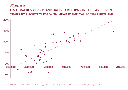
This variation in performance given different starting points is well understood; it is simply investment risk. What is less well understood is the vastly different outcomes for portfolios which achieve the same overall percentage return, but pay regular cash flows.
Of these 1,237 sample portfolios, 45 had annualised returns in a narrow range between 6.9% and 7.1%. Taking this sample set and assuming each withdrew $65,000 a year
(6.5%) in monthly instalments over the 20 years, the final portfolio values range from $0 to over $2 million. As many as a third of these investors end up with less than the $1 million they started with.
Remember: each of the 45 investors has an almost identical overall return, which is greater than their withdrawal requirement. Nevertheless, their experience differs wildly, with some losing their whole investment while others double their money. How can this be?
Click chart to view larger image
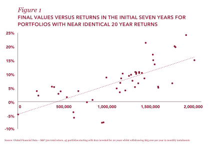
Figure 1 plots the final value of each of the sample portfolios against the annualised return achieved in the first seven years.
As we would expect, portfolios with strong early returns – the dots towards the top of the chart – generally cluster towards the right and have higher final values.
By contrast, portfolios with weak early returns are clustered towards the bottom left of the chart, signifying low final values and, in one case, a complete loss of wealth. This shows that strong performance in the initial period is crucial to achieving a good final outcome.